For any information on this exhibition or the availability of the works please do email us at the gallery: info@beauxartslondon.uk or telephone us: 07917 405 747


For any information on this exhibition or the availability of the works please do email us at the gallery: info@beauxartslondon.uk or telephone us: 07917 405 747
Please Click the Link Above
Terry Frost: The Radiant Moment
‘You make your myth and you paint it.’ TF
Twin forces propelled Terry Frost: other people’s art and his passionate response to the world around him. Coming late to the painting life (as a prisoner of war he learnt the basics and hit upon his metier), he had to make up for lost time and applied himself with all the seriousness of the mature student. He learnt through friends and colleagues: first from Adrian Heath, his mentor in prison camp, then from the teachers at Camberwell School of Art (1947-49), and particularly Victor Pasmore, but also from the artists of St Ives where he chose to settle after the war. Ben Nicholson was an inspiration, and so was Peter Lanyon, while Frost’s stint as an assistant to Barbara Hepworth (1951-2) taught him about form the hard way, especially when he had to carve ten tons of Connemara blue marble. He absorbed Cubism through Nicholson and Heath, and discovered landscape with Lanyon. Later he became allies with Roger Hilton, one of the most uncompromising figures in post-war abstraction.
Frost painted his first abstract in the early 1950s before going to Leeds University in 1954 on a two-year Fellowship. These severe early pictures are rigorously non-illusionistic, composed of flat shapes and colour, with no visible perspective. The thrust of the image depends on proportion and relationship. Frost’s heroes were Kupka and Malevich, El Lissitzky, Kandinsky, Tatlin and Rodchenko. For instance, seeing Lissitzky’s design CCCP! was an epiphany for Frost. In this he seems to have something in common with James Joyce, who adapted the Christian epiphany (or manifestation of Christ to the Magi – usually celebrated on 6th January, our Twelfth Night) to describe the sudden ‘revelation of the whatness of a thing’. Joycean epiphanies evoke that moment when ‘the soul of the commonest object seems to us radiant’. And this is what Frost did – paint the radiant moment.
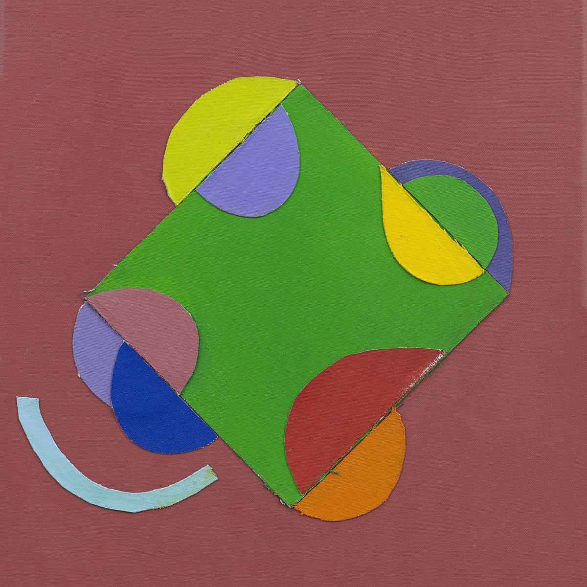
Frost was first and foremost a romantic, by disposition and intent. Genial and gregarious, he was also subject to fits of melancholy and depression, the other side of his optimistic high spirits. Too often we think of Frost simply as the artist of joy, of ‘Life is just a bowl of cherries’, his oft-repeated and somewhat misleading mantra. Actually, Frost knew the dark side just as well as the light, which is why his work still has relevance and potency. As Adrian Heath pointed out, for Frost emotion was more important than reason, and he found that direct and spontaneous action produced more authentic results than calculation and planning. But he always needed a structure of formal discipline to present and contain his intuitions, and he first learnt the glimmerings of this at Camberwell, under the tuition of Victor Pasmore. It was Pasmore’s use of collage, for instance, that set Frost on the path of sticking cut-out canvas shapes to his paintings – one of his most successful stratagems and a recognized leitmotif of his work. Patrick Heron wrote in 1956 that it was from Pasmore that Frost absorbed ‘his extremely subtle feeling for surface, for a sort of dry opulence of touch, which conferred great sensuosity and a richness of texture and colour upon what might otherwise have remained an austerely architectural configuration.’
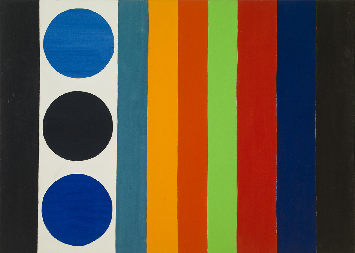
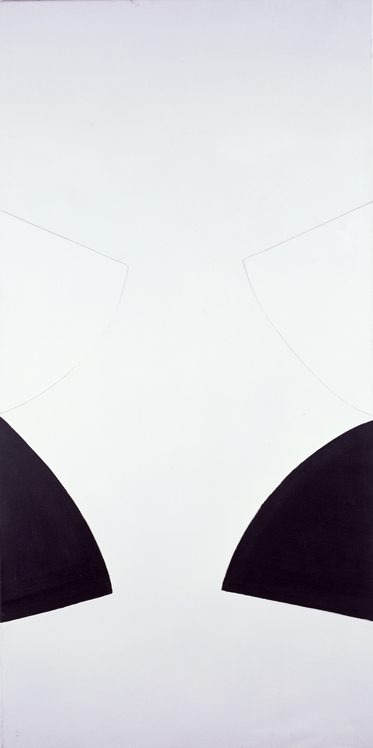
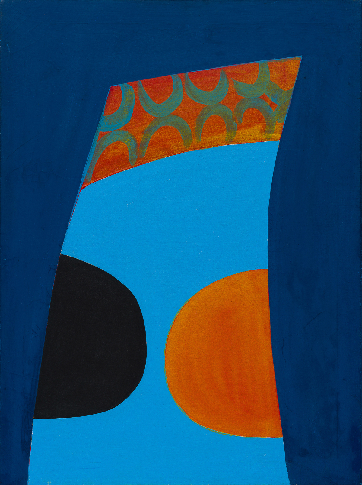
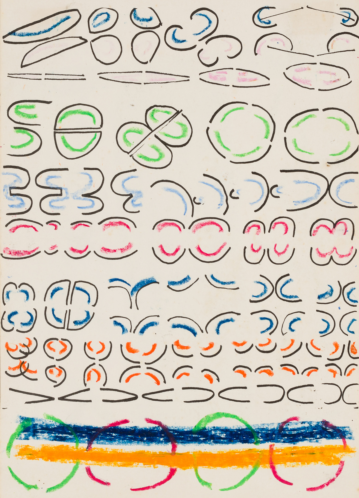
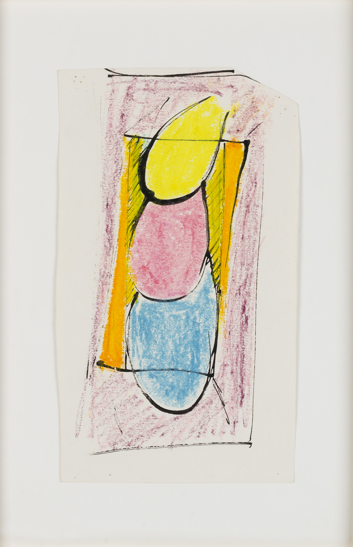
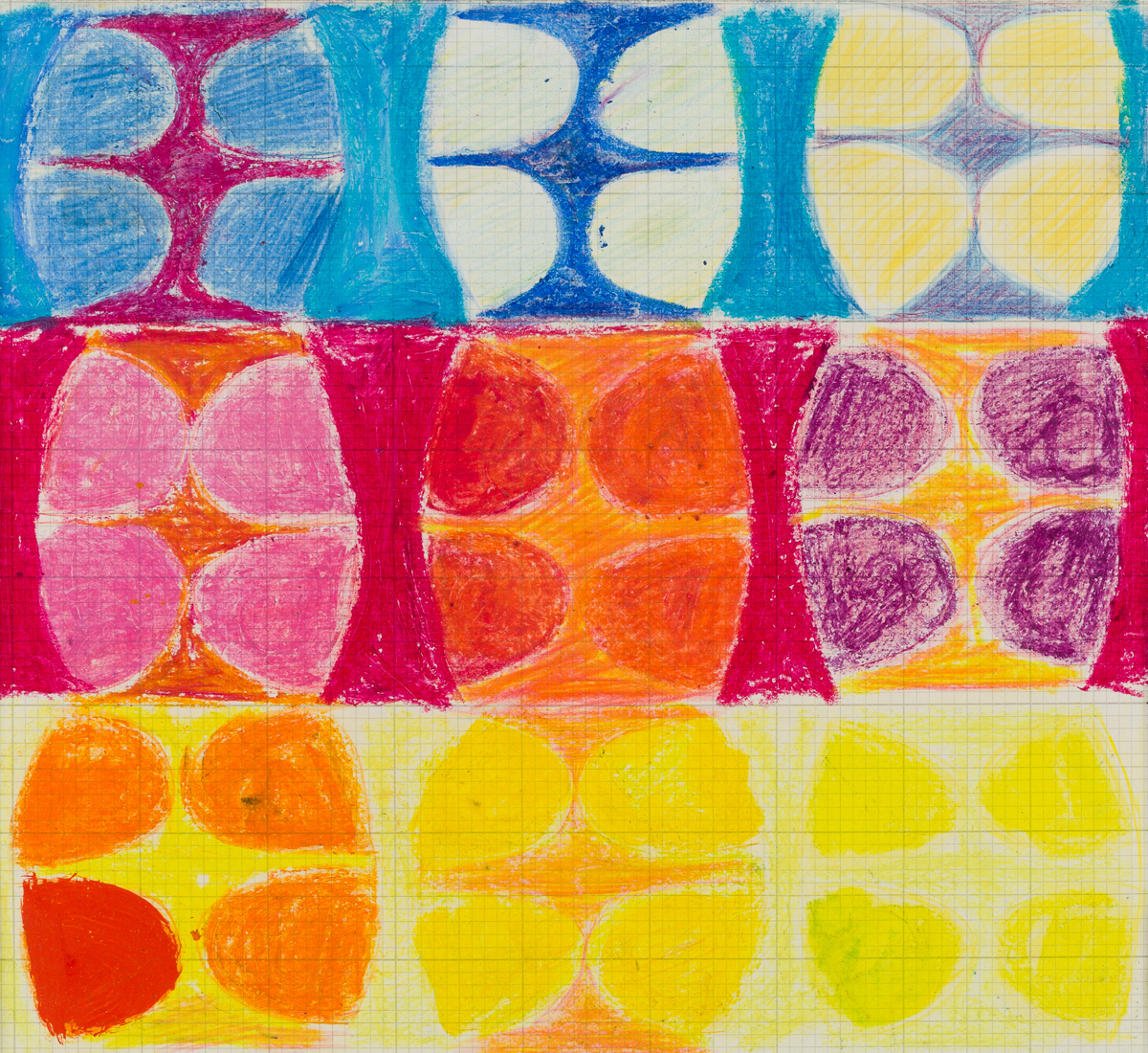
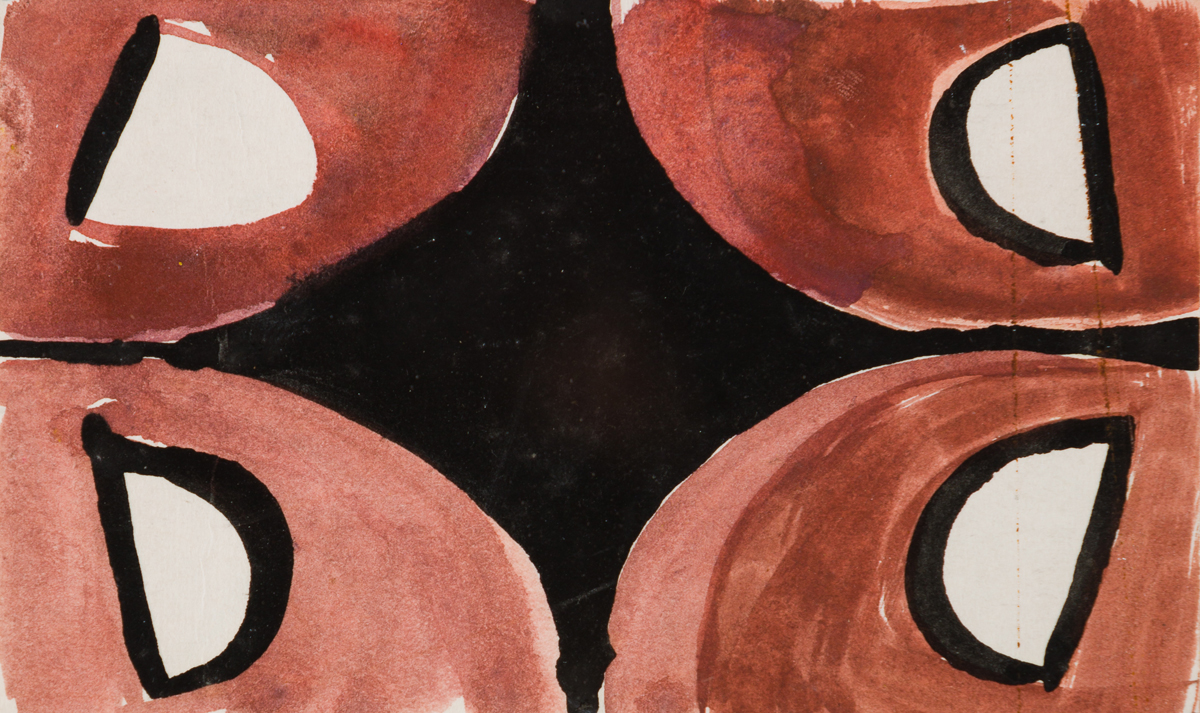
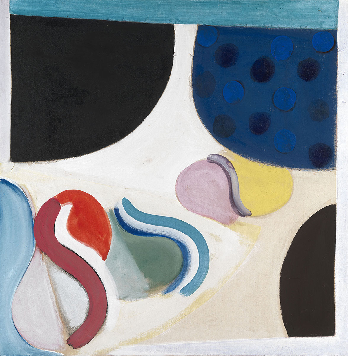
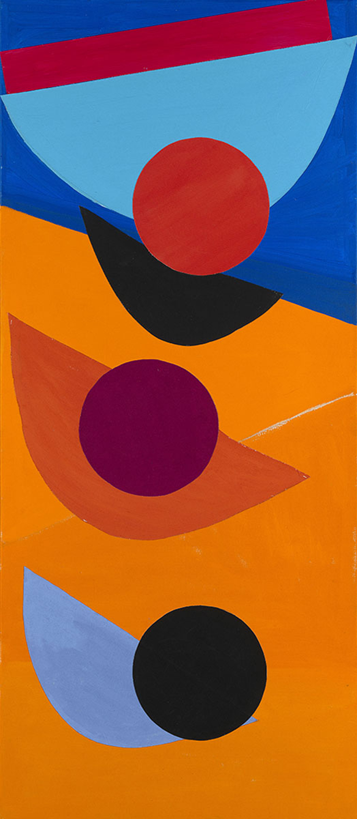
Frost painted generalized shapes in taut formal relationships to summon up the underlying structure of reality. A long-standing fascination for the curve was coupled with a love of swinging, suspended forms, but he was always prepared to drive a wedge between them should the picture demand it. In his imagery the crescent is a boat, but also a breast or a bottom. (Heron referred to Frost’s melon slice forms.) These jaunty shapes are also his grandmother’s stays or sails filling with sea wind. Essentially, Frost’s approach to painting was one of constructing with non-figurative units: discs and half-discs, ovals, chevrons and arrows, curves, loops and rods, zigzags, lozenges, spirals, beams and balances, slats and stacks, arcs and ripples.
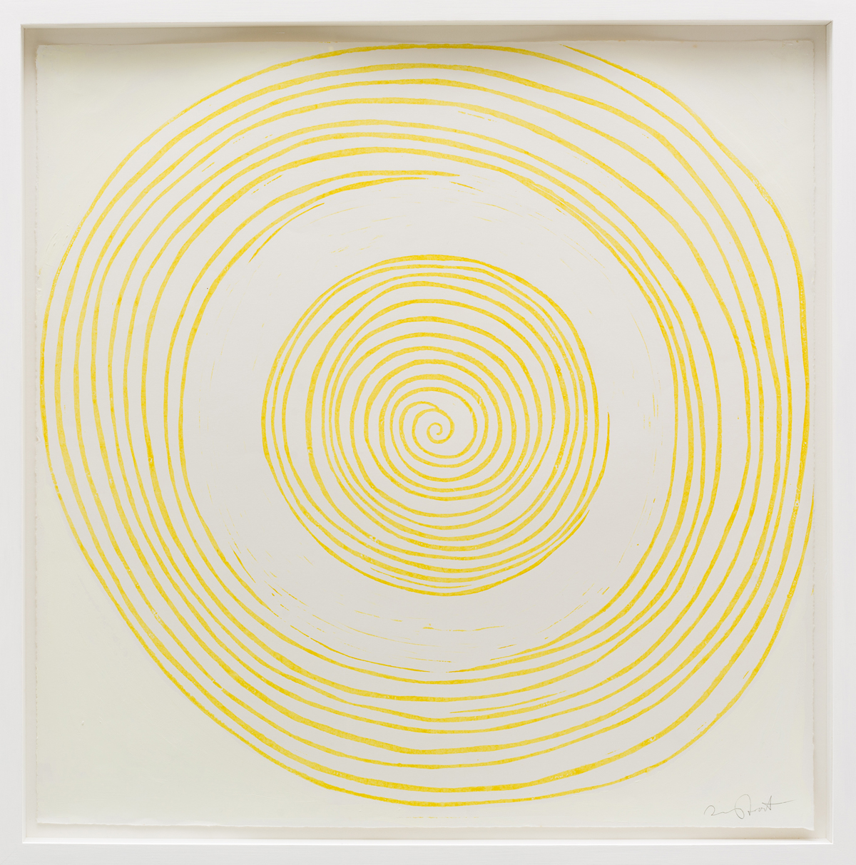
The spiral, a distinctive growth form, was a favourite. In his early abstracts, Frost stretched loops of string across his canvases and traced their curves for his Quay paintings. He was adept at movement and counter-movement: the rise and fall of boats on the sea, the space drawings of the mast-heads. Frost evoked blue twilight, brown shore. He aimed to paint an arrangement of forms and colours that would be an equivalent to something seen, in the sense that it offered a counterpart to the feeling engendered by the initial visual experience. According to Arturo Di Stefano, who recalls making prints at the same time as Frost in Hugh Stoneman’s Cornwall studio, Frost referred to the adventitious, happy accident during the process of making art – the magic which takes place who knows how – as ‘the old kizwotzi’. Frost knew that this could not be explained, so adopted a typically blithe nickname for it. In part it is about the experience of colour, in part the emotional power of a drawn line. Then for him there is the deep strain of celebratory eroticism – with bikini shapes, pubic chevrons, chevrons as nipples and indeed as symbols of penetration adding an undeniably sensual texture to his work. Attention to the formal aspects of his work was crucial, but his chief motivating force remained ‘a state of delight in front of nature’.
There were specific visual events that particularly inspired him, such as walking through Wells Cathedral and experiencing not only the fall of light (bright pool and shadow) but the magnificent inverted bracing arch under the tower and the ribbed vault of the octagonal Chapter House, like a great palm tree. Early in his career it was the landscape of Yorkshire: field patterns of black stone walls with sheep huddled in corners, the lines of white washing hanging behind the terraced houses of Leeds. Frost said of the whole experience, ‘you are walking through poetry really’, and the powerful abstracted landscape paintings he made were his heightened response. A lifelong passion was watching the sun dipping behind a mountain, firing the world with colour, separating light from shade.
Frost’s habit of work was to see things, let them be filtered by memory and imagination, and then trace an idea from the residue. This is essentially a process of re-discovering (and perhaps re-inventing) the moment. The majority of people blunder through life without being particularly aware of their surroundings, but artists are among the few who really look. Most people see, but do not observe; artists, like bird-watchers or botanists, are trained to use their eyes. Frost regarded this ocular awareness with mixed feelings. He wanted the innocent eye, not the tutored one. As he wrote in 1954: ‘To look with preconceived notions of visual experience is to destroy the possibility of creating again that experience in paint. If you know before you look, then you cannot see for knowing.’ And in 1973 he elaborated: ‘If you look you can’t see for looking. Looking for something to inspire you to work is an escape from taking action. The decision to take action is the only way of seeing.’
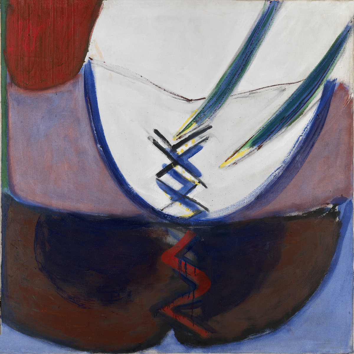
The painting itself should be a process of discovery, with the artist maintaining a freshness of looking throughout. Roger Hilton set a standard for the honesty of response, and the two embarked upon a fruitful and usefully competitive relationship which took them to the extremes of abstraction and back again. Frost, like Hilton, believed in the adventure of painting. (Hilton wrote: ‘Painting must be given back its soul.’) Their shared goal was to access the kind of truth that only painting can reveal: visual knowledge that is a mixture of the intentional and the intuitive, the shrewd exploitation of chance, the decorative and the conceptual.
Although 1959 saw a landmark exhibition at Waddington Galleries entitled Four English Middle Generation Painters, featuring the work of Frost along with Hilton, Heron and Bryan Wynter, it was not until the 1960s that Frost came fully into his mature language of signs. This was closely linked with his move to Banbury and the adoption of a more self-consciously urban imagery, incorporating a much more threatening vocabulary of heraldic road signs and lorry fronts, full of implicit warning. Frost had wanted to escape St Ives: Ben Nicholson had left and as Frost put it, ‘the thing has died on me’. Until that point the sea of Cornwall and the moorlands of Yorkshire had dominated his work. Thereafter, with the move to Banbury, his imagery became more universal.
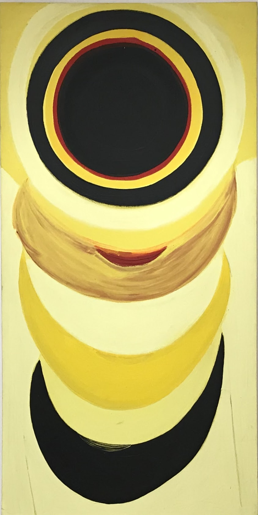
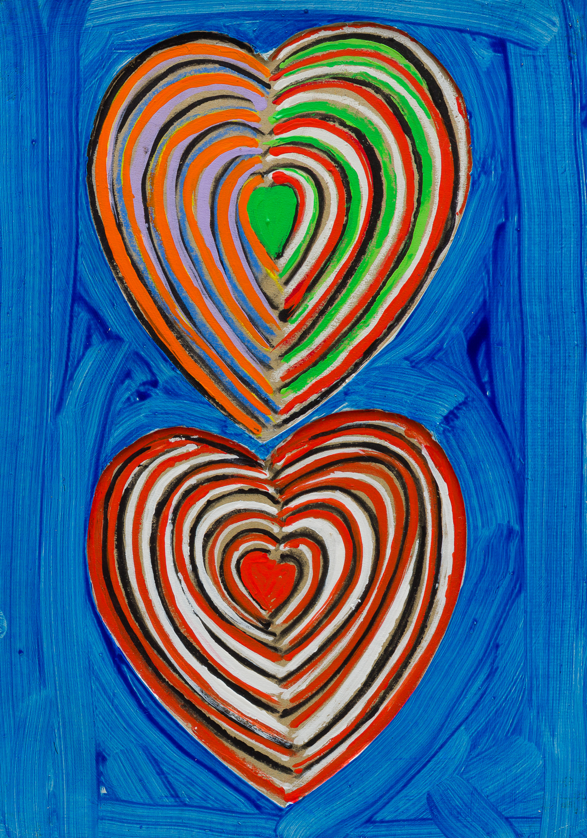
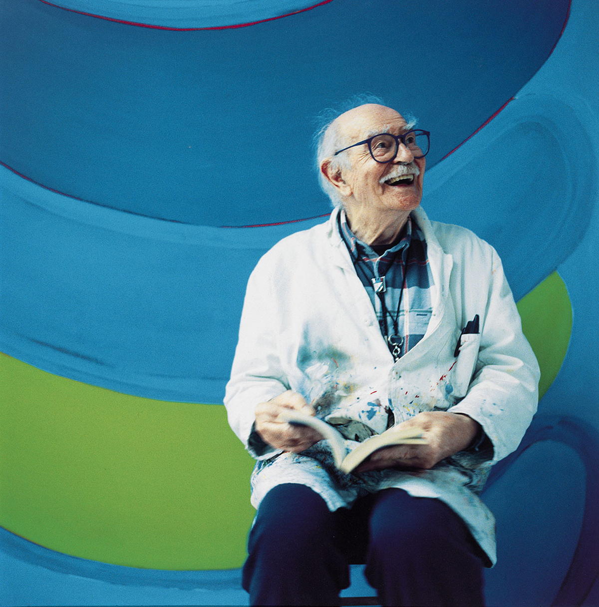
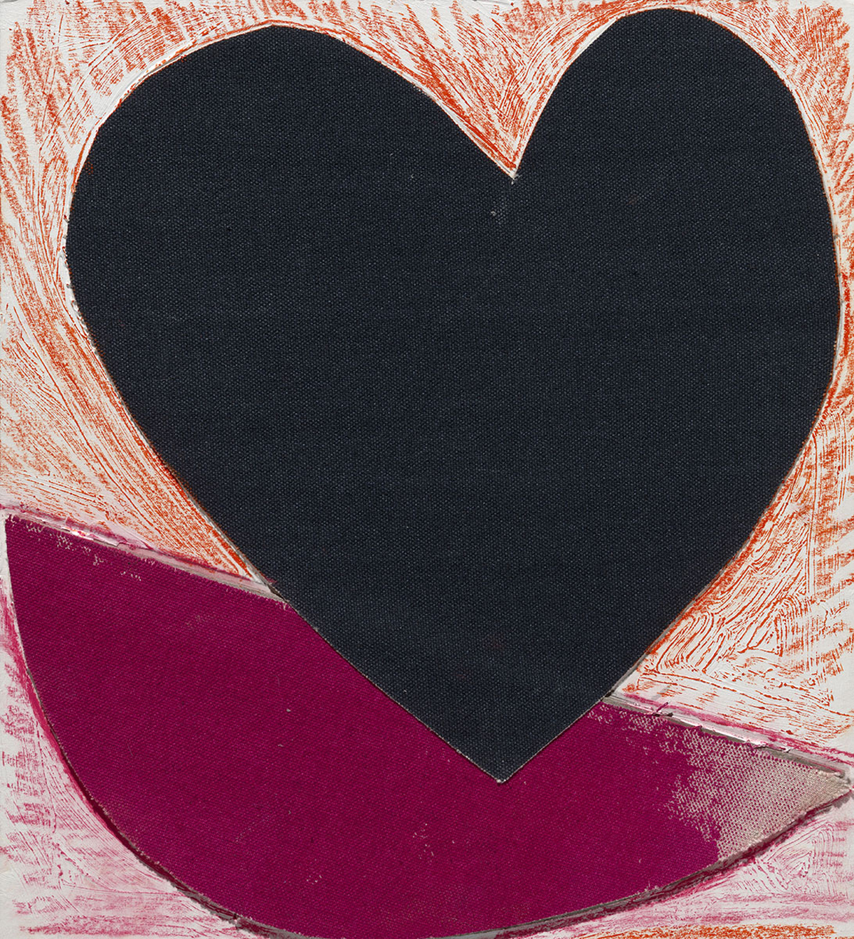
In 1974, Frost moved back to Cornwall and settled in Newlyn, where he stayed for the rest of his life. The work of this last period is characterized by purer colour and more geometric forms, the earlier scratchy and abrupt marks giving way to an increasingly fluid and expressive paint-handling. Later some of his signs became more overt in meaning – two parallel verticals to suggest a tree, dense black ovals for olives, hearts. The sun (or moon) had always been present as itself, and bobbing quadrants or semi-circles, sometimes with angled spars, suggested boats or the female body. Frost spoke of having a crowd of ideas and images rushing around in his head; the difficulty lay in deciding which one to concentrate on. He described the moment of truth – ‘it doesn’t come by chance. You have to want to be carried away to the main idea. The real problem is then with you, sorting it all out to find the particular and find a simple way of saying it.’ (From a notebook, c1980.) Frost was a master raconteur with a selective memory: he relished embroidering or even making up his stories. As an artist, he claimed to rely on his memory, but as his increasingly wild and hilarious anecdotes revealed, imagination also played an important part. Despite his prolonged absences from Cornwall (or paradoxically because of them), Frost grew to be the living personification of St Ives and its artistic community. Perhaps one of the reasons he was seen as such a figurehead was because he outlived so many of his contemporaries (Lanyon, Hilton, Wynter, Heron all predeceased him), but also because of his outgoing personality. I remember Cornish taxi drivers (including a hard-bitten ex-lead guitarist from a rock band) loud in their approval of Terry and what he stood for. He became the acceptable and popular face of British abstraction, a status only confirmed by his knighthood in 1998. It’s impossible to imagine the cantankerous Hilton – even if he had managed to survive into old age – readily accepting such an accolade.
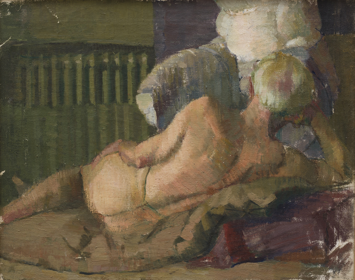
The earliest painting here is the realistic Self-Portrait, which must date to 1948-9, when Frost was at Camberwell School of Art and solidly under the influence of Victor Pasmore. Frost recalled that Pasmore grew a beard so he followed suit. He commented: ‘Lawrence Gowing looked at my beard one day and said: “Just do a self-portrait and you’re made.”’ This self-portrait shows Frost wild-haired and bohemian, with the beginnings of a beard which was to grow much fuller and make him look like an Old Testament prophet or a character from the Bloomsbury Group. The artist at the beginning of his career confronts himself in the mirror, wondering what it’s all about. That there’s no easy answer (except work) is apparent from the slightly defensive and embattled look in his eyes.
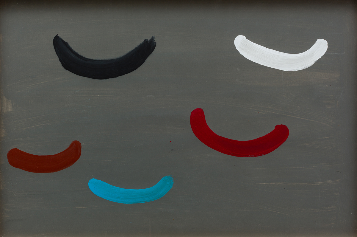
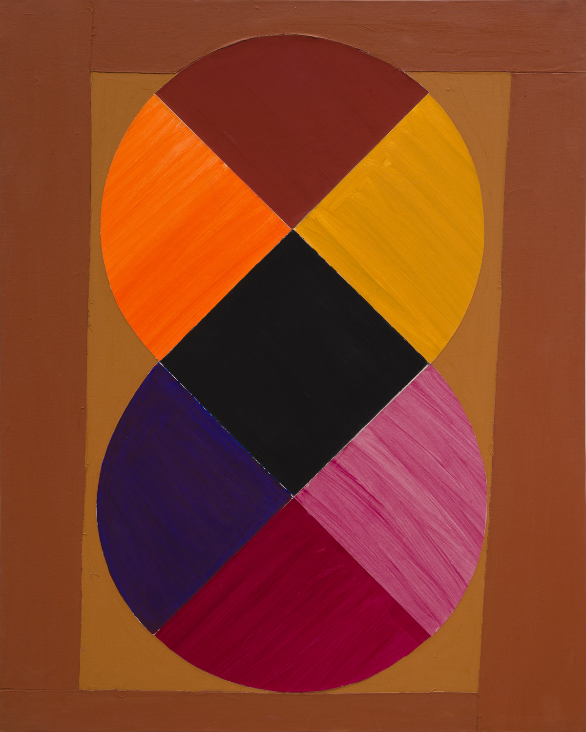
Red, Black and White Movement (1968) is a shaped canvas with the clean-edged quadrants of a circle or oval bouncing off each other like magnets in repelling mode. Here the expressiveness of the paint surface has been suppressed, though the sharply angled dynamic is both static and animated and surprisingly satisfying. A very different treatment of the same colour trinity can be found in Red, Black and White Delight, which features a square within a circle within a square, the paint handling bold, rhythmical and brushy.
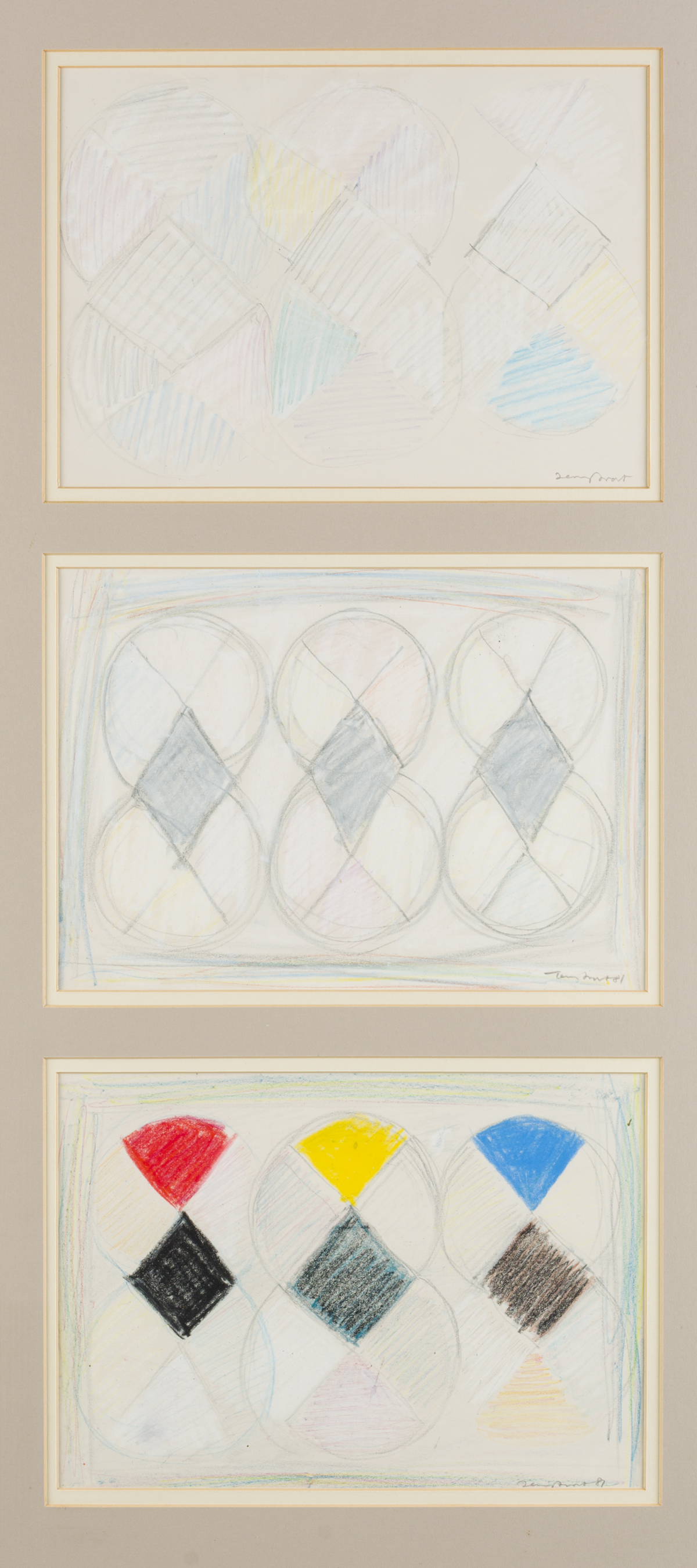
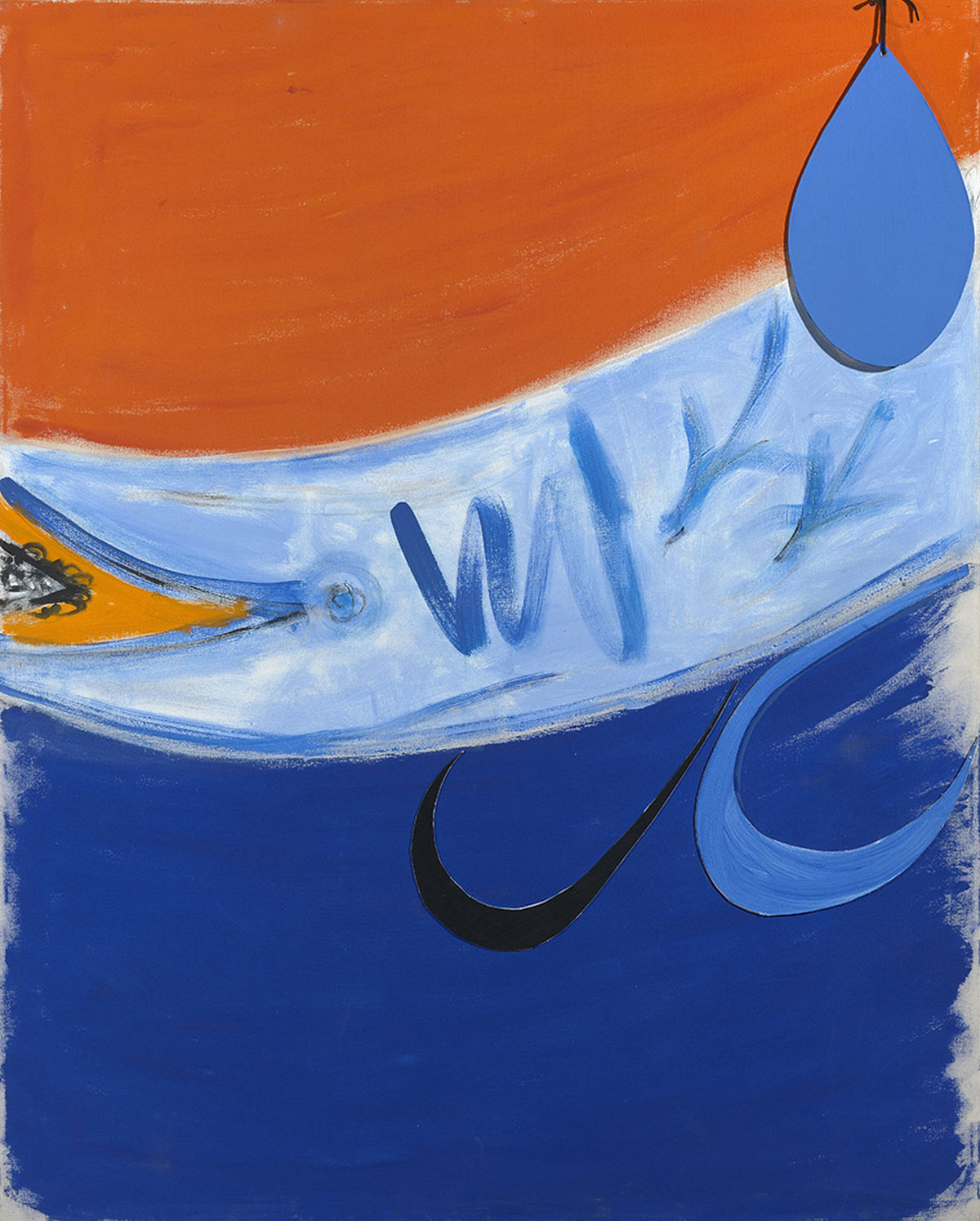
Tears of the Sun is a large acrylic from 1995 in which five fat teardrops fall down a tri-partite canvas, horizontally divided into green, red and yellow. The tears are one black, two red, two blue. Typical Frost: exuberant and life-enhancing, executed with complete and infectious naturalness, with sure economy of gesture. Lizard Light, an acrylic of 1996-8, is a black and white evocation of different times of day over the Lizard Peninsula in Cornwall, from sunlight to moonlight with a ruffled reflective sea between. Frost was expert at black and white dazzle, and made consistently intriguing use of white, not just the virgin white of paper or canvas, but the liberal yet judicious application of white paint. (Three Drawings for White Out (1981) are pencil and pastel studies for possible arrangements of geometric colour elements against white. He was equally at home painting black olives or a great black disc of sun like a vinyl LP.) ‘When you paint black, it must have colour’, he declared, and emphasized that there is no such thing as pure black – there are, for instance, blue blacks and red blacks, each with a particular colouristic slant or emphasis. Frost used black and white with lyrical aplomb. He spoke of them behaving sensuously together: ‘almost copulation at times’.
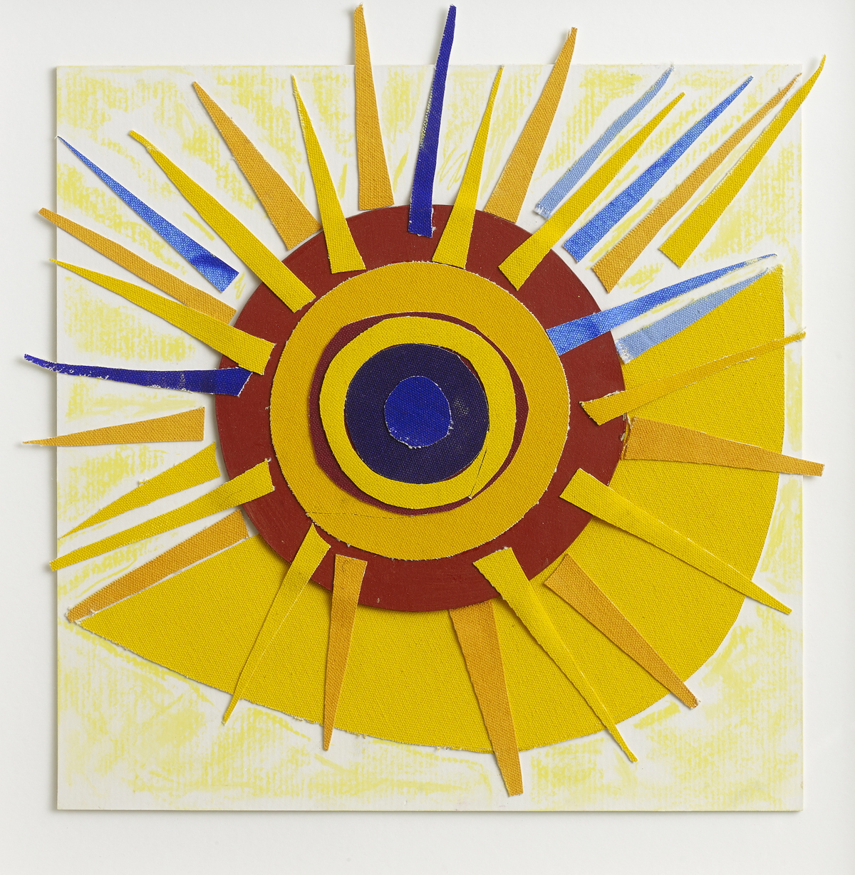
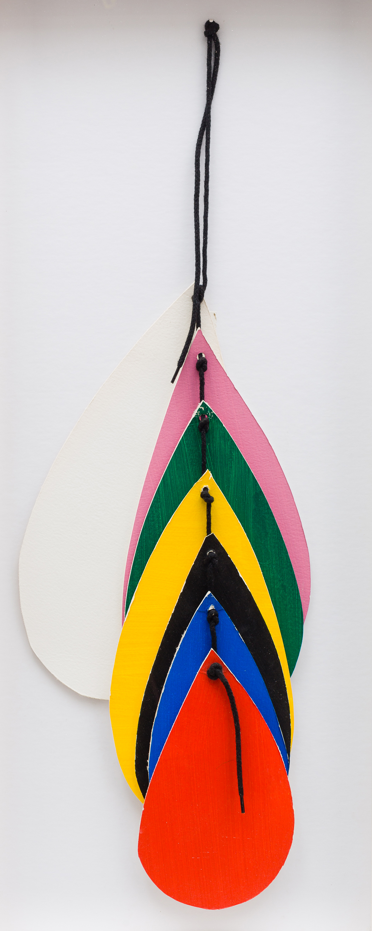
There was a blue moon during the writing of this essay, and as I watched the huge golden orb sail through the cloud-articulated sky, I thought of Frost’s delight in the whole range of natural light, from moonlight to full sunlight and back again. A blue moon is a special dispensation, a gift from the gods – a second, additional full moon in a calendar month. It happens only rarely and its serendipitous nature appealed to Frost, who painted the subject several times and in 1952 made a lithograph with this title. In Frost’s late work there is an even greater liberation of knowledge and instinct, spontaneity and risk: painting and drawing merged, as did colour and line in the crisply cut collage elements he used. His simple, almost primitive methods of collage were entirely suited to the effects he sought, and are triumphantly realised in such late bright collage paintings as Frisky (2003) or Swing Purple.
In 1987 Frost declared: ‘People have got to be prepared to go overboard if they want to understand what artists paint. Otherwise they don’t deserve to know anything about art.’ His is an art of inner necessity, packaged and presented via external sources of inspiration. The vigour of his improvisation is as beguiling as the reverie it provokes. Terry Frost’s best paintings renew in us the sense of joy, inflected with humour and wise melancholy. The combination is irresistible.
Andrew Lambirth July-August 2015
Andrew Lambirth is the author of numerous monographs on Modern British artists, including Roger Hilton: The Figured Language of Thought (2007) and the forthcoming William Gear
A Late Gathering
It would be right to see this late gathering of works from his studio as a fittingly joyful celebration of a brilliant artist who was one of the great entertainers of late 20th century British art, and one of its freest spirits. It was the insouciant ebullience of his painting, and his unerring creative certainty, that inspired such widespread admiration. Terry Frost had, indeed, many fans: I use the term with care, recognising that there was a sizeable element of self-aware performance in his public persona (and remembering also that persona derives from the Greek for ‘mask’). The warmth of their appreciation was a (largely unwitting) vindication of his unabashedly passionate avowal of the living agency of art in the everyday world of ordinary people, its power to affect the ways we experience things, and to bring deep and complex pleasures. His art opened the eyes of others to the ceaselessly kinetic surprise of the visible world. Frost’s paintings have the capacity to bring to the spectator excitements both perceptual and conceptual – pleasures of the eye and of the mind. They do not represent the world as viewed through the perceptual frames of single-viewpoint perspective, and rendered in naturalistic tonalities, both of which, soon after finding his way to abstraction in the early 1950s, he emphatically rejected as being untrue to the deeper realities of imaginative experience.
Rather they present, in purely abstract terms, directly manifest in visual and structural demonstrations, familiar experiences in real space and time. Of Walk Along the Quay (1950), his first fully achieved abstraction, he wrote, ‘[the] walk through space was an experience and not a window perspective thing at all, it was a Time experience.’
Such experiences in time, of being and seeing, of spinning, tumbling, rocking, touching, nudging, leaning, converging and diverging, are re-enacted in his paintings by a regular repertory cast of shapes and signs deployed across the flat theatre of the picture plane: spirals spin; flat discs of colour wheel and tumble; half-discs rock like colourful boats in harbours and marinas, Newlyns of the mind, Greek ports of holiday memory; rod-like verticals fall sideways, strokes and dots scatter; ellipsoids stack and lean as precariously as a soft Tower of Pisa, or swing and sag like half-deflated balloons; colour rings and ellipses misbehave like shaken bangles. These optical movements in apparent space are a function of cunning and ever-changing configurations of the quasi-geometric, largely pre-determined colour-shapes I have just described, put into play on planes, or sometimes, as in Green Below (2003), against bars, of pure colour.
One of the reasons why Frost especially loved collage was that it gave him the freedom to move his shapes around the support until the eye was struck by a visual dynamic that served his thematic purposes. Frost enjoyed this process in which improvisatory interaction with the very stuff of the image led to its final definition; it was a kind of symbolic re-capitulation of past actions, reactions and perceptions, of vision-in-movement recollected. The compositions of his later acrylic paintings were frequently arrived at by the preliminary use of collage in this experimental way. For Frost a painting was something ‘constructed’ out of actual materials manipulated to exploit their specific properties. This process of making was essentially intuitive, but it was tuned and refined by the study not only of nature but of art. He was a master technician, but his was an art that often concealed art: it looks so often as if the apparent spontaneity of his expression were somehow simply given. But this was never so. He paid close and intelligent attention to the art of the past, classical and modernist, and from his study of gifted contemporaries he learned what was needed to create an art rooted in the phenomenological. His most influential mentors, Adrian Heath and Victor Pasmore, were both deeply embedded in post-war British modernism, and much concerned with the abstract representation of dynamic energies and concrete relations. Frost’s predilection for directly performative practical engagement with his materials went back to his involvement with the practices of ‘Basic Design’ during teaching in the late ‘50s at Leeds College of Art where Harry Thubron and Tom Hudson were among his colleagues. (He contributed at that time to a booklet about creative methodology entitled The Developing Process, in which various playful improvisatory image-making exercises were proposed.) It also found expression, for example, in his often expressed delight at the execution of a successful spiral, the vigorous, precise and almost automatic action of which imitates the vertiginous movement into the vortex or (as in Untitled (orange and green) of 1996) an expanding centrifugal spin outwards from its centre. In either case the artistic procedure and its pictorial outcome recall the exhilarating experience of the actual. When, in The Developing Process he wrote of frequent exercises and concentrated practice as enabling his students’ work to ‘grow as in nature’, he was speaking also of his own practice.
From his teaching at Leeds (and later elsewhere) derived Frost’s deep understanding and systematic exploitation of colour intuitions: of colour as light, colour as temperature, colour as an emotive determinant of mood, colour as sensuously pleasurable, what he called the ‘cool and warm of colour’. He agreed with Matisse: ‘Colour exists in itself, has its own beauty’; but always, he qualified, as a component of our phenomenological awareness. ‘Colour for feeling’ he wrote, ‘to do with imagination and reverie, inspired by actual experience.’ Frost’s critical consciousness of the underlying nature of his creative purposes (at once technical and philosophical) was at times revealed with a knowing irony, but often disguised by a down-earth self-deprecatory humour. Both his conception and his practice of abstraction were assiduously and critically materialist, and it had no truck with metaphysics or any cast of the religious. But he was no stranger to beauty, awe and wonder, and his art was before anything else expressive of those responses to the world about him.
He marvelled (‘marvellous!’ was a favourite exclamation of the artist) at the perceptual phenomena that make an opaque surface of pure blue a limitless summer sky to the eye (Newlyn Bowjey, 2000-2001), or a plane of pure orange appear to imitate still harbour water in one painting (Newlyn Bowjey again) and Mediterranean sunlight in another (Orange and Blue for Aphrodite, 1995), or which can induce the sensation of movement as we look at differently-angled half-discs appear to swing to and fro like moored vessels (Green Below), or that reads into a quartered disc two yachts moving apart, each reflected in the water, a simple relief object transformed into a little regatta on a summer sea (Untitled Construction, 1965). But it was more than simple and playfully suggestive optical illusions that he was after: from the moment of his very earliest achieved abstract paintings he was concerned with the creation of a sensation in the viewer of a something closely akin to the experience of nature. Frost embraced abstraction because he wanted to celebrate awareness and that entailed the requirement to be true to the intoxicating reality of being alive. The old ‘realisms’ seemed inadequate to the task. The moral imperative that underpinned his work had deep roots in his character, his intelligence, and his life, especially his experience in the war and as a prisoner-of-war. He became and remained an artist with a profound sense of purpose sharpened by hard knowledge and real and particular privations. It was this that gave a distinct sense of urgency to his abstraction in the 1950s, and a celebratory joyfulness to his later paintings and prints in the years of his public success.
The first truth in painting was the blank plane of the support. ‘Abstraction taught me’, Frost wrote, ‘to recognise the flat surface. How was I to paint the experience I was having…? I really did think there was a chance of making something happen in an analogous way on the flat surface, the flat surface being the vital important start. From understanding that, you can move into colour and what it does by intensity, proportion, overlap, etc.’ Rather than the naturalistic description of sky, sun, trees, the rocking of boats, the swell of water, the human figure in a landscape, his painting presents us directly with pictorial analogues to the complex of perception and response, seeing and feeling, that constitutes a moment of being in the world. Solar light and terrestrial or marine colour; the felt movement of walking or turning; the bodily sensation of mass, of gravity and bag-like sag; the swerve and whoosh of sea water. His paintings are not topographical prospects (a landscape of a wood, a harbour ‘scene’) or factual documentations of an event (a person in a room, boats in a harbour), neither are they precise remembrances of things and places past: they exist, rather, as particular objects in a perpetual present, in the immediate actuality of the viewer’s present encounter with them in the living moment.
Writing of the early abstract paintings that reflected his daily experience of St Ives, Frost was emphatic: ‘I was not portraying the boats, the sand, the horizon, or any other subject matter, but concentrating on the emotion engendered by what I saw. The subject matter is in fact the sensation evoked by movements and the colours of the harbour.’ Thus, as we have seen, his painting provides the occasion for what the American aesthetician Suzanne K. Langer called ‘symbolic import’; it is a vessel freighted with thought and feeling, memory and desire. It is painting conceived as a kind of poetry or myth, which discovers a universal theme or motif in the artistic transformations of the everyday-actual: ‘I’ve said you make your myth and paint it’ Frost wrote. ‘My memory is what I rely on. A moment of discovery when I happen to be made aware, or aroused by something I discovered, by surprise: that goes into my store and that becomes my time and space and by the time I use it it’s myth that I’m working on.’
As Frost developed and exploited with great aplomb and unaffected virtuosity a wonderfully subtle, and supple, visual language of sign and analogy, the paintings of later years, such as those gathered here, achieved this evocation of sensation and emotion with greater and greater simplicity. ‘Exactitude is not truth’, wrote Matisse, whose beneficial spirit hovers over the joie de vivre of late Frost. ‘It is enough to invent signs.’ Frost’s repertoire of ‘signs’ became sufficient to his deepest purposes: to disengage the essence of a visual experience, Matisse’s ‘inherent truth – the only truth that matters’ – from the outward appearance of things; and to register and communicate in his deployment of such shapes and signs on the flat surface nothing less than ‘a state of delight in front of nature.’
His bravura ringing of the changes and endless improvisations with familiar visual devices, combining and re-combining them within the rectangle of the canvas in ever-different configurations, playing freely with repetitions and rhymes, with equilibriums and imbalances, are as infinitely various as are the movements and configurations of the objects in the natural universe and the human world to which they obliquely and ambiguously refer. Above all, it is colour, with its harmonies and discords of hue and tone, its varying intensities of saturation, its virtuoso music of red, black and white, that creates the light, space and time within which those objects continuously move and interact. ‘I am not copying nature,’ said Frost, ‘but endeavouring to construct my paintings in the same way as nature, so that they have a trueness about them and a reality as big as nature.’
Mel Gooding January 2012
Quotations from Terry Frost are taken from informal writings (a selection of which were published in a pamphlet in 1986, Terry Frost: Painting in the 1980s, to accompany the touring exhibition of that title organised by the Department of Art, University of Reading and Newlyn Art Gallery. ‘Basic Design’ was essentially a pedagogic system, derived largely from Bauhaus ideas, for teachers in English art schools, and was for some years highly influential. It encouraged individual experimentation within a programme of rules and procedures; these were intended to develop disciplined creativity through process and the understanding of fundamental dynamic principles. Thubron and Hudson were prime movers, together with Pasmore and Richard Hamilton. The Developing Process was published to accompany an exhibition at the ICA in 1959. Matisse is quoted from ‘The Path of Colour’ and ‘Exactitude is not Truth’ in Matisse on Art ed. Jack D. Flam (Phaidon, Oxford, 1973).
Frost: A lover of life
When I went to see Terry Frost at his house above Newlyn in 1994 he was one year short of 80, but still brimming with vitality. One of the first things he told me about was the trip he had made to the USA, and the series of images involving spirals that had come out of it (Arizona Spiral, 1990-94, in this exhibition is one of them). ‘The spiral motif all started’, he explained, ‘because I went to see my eldest son who was in Tucson, Arizona, and he took me into the desert as far as the Grand Canyon. It was a shock to me because the desert I saw during the War in Egypt was all sand. Here there were cacti 14 feet high all in bloom, and wonderful mountains all around. There were blue mountains, pink mountains, white mountains, double rainbows and thunder clouds! The whole thing was a spiral of excitement. So it started a relationship for me with the idea of foreverness.’
That whole account was completely typical of the man: the joyous pleasure in the visual world, the easy, apparently straightforward movement from a concrete experience to an abstract shape – a spiral – and then an idea: eternity. When I found the cassette tape of our conversation 15 years ago and put it in a near-obsolete machine, Terry Frost was immediately there in the room with all his joie de vivre and enthusiasm. His was an unusual career in art, if only because – like Van Gogh’s – it did not properly begin until he was almost 30. His delayed entrance into the world of painting came as an unpredictable result of being taken prisoner of war by the German army, and sent to Stalag 383 in Bavaria. There he came across the painter Adrian Heath and other artists and scholars of art, and received a sort of ad hoc further education not just in aesthetics, but in a moral world-view.
‘I think perhaps I was lucky in not being educated at a university. In a way I was educated in the prison-camp where I met Adrian Heath and the other lads, who had been educated by life – so they were kind, considerate, even the man who pinched my bread turned out to be marvellous. I came to the conclusion that there is more good in people – everybody – than bad. That’s a hard conclusion to come to, but I reached it in that POW camp.’
If he had not been deposited by fate in Stalag 383, Frost would doubtless have spent his life doing mundane jobs in the West Midlands (he was born and brought up in Leamington Spa), and never found his true vocation. Naturally, therefore, that wartime and immediately post-war moment – when British society seemed to change and a new world open out – was very important to him. ‘People were very kind, it was so different to before the War when you had to doff your cap to people across the road and you daren’t put your foot out of line or you got the sack. But the doodle bug didn’t differentiate whether you had been to Oxford or Elementary school. Bullets didn’t differentiate. I found it a wonderful period, everybody helped each other.’
Just at that moment, Frost was discovering the whole world of modern art, and with it abstraction. In the 1940s, through a series of lucky chances, he quickly found himself in the centre of British modernism. Adrian Heath recommended him to go to St Ives. Ben Nicholson and Barbara Hepworth were neighbours; Peter Lanyon took him for walks through the landscape. Frost was strongly attracted to another period, a quarter of a century earlier and in another country, when there had seemed to be a similar dawn of equality – in Russia immediately before and after the 1917 revolution. ‘The Russian constructivist movement’, he remembered, ‘was very much of a force on us. In that revolutionary moment, thinking they were making a new art for the people, they had had terrific structure, wonderful design that went through their ceramics and every medium. Rodchenko’s photography, and El Lissitzky’s typography were absolutely fantastic in that period. ‘Then there was Malevich’s Black Square – why should it be such a knock-out? It stops my heart whenever I see it. It’s more than perfection. It’s love and it’s beauty, and it’s poetry. It comes from a period when there was great hope and great opportunity.’
That’s the essence of Terry Frost’s art too: simple forms filled with feeling, love, beauty and poetry. Indeed, he found that however austere the geometry he used, feelings and bits of the natural world kept creeping in. ‘I did do pure abstracts, using semi-circles, triangles, geometry – a lot of things that were worked out mathematically. I did that quite religiously, because I believed in it. But even so, once you put a bit of colour on – such as that pale ochre over there on the bench – that was to me the colour of the sand outside my studio, and I couldn’t stop the relationship, even if I wanted to be purely abstract.’ After all, total abstraction is an impossibility. Every form in geometry is bound to suggest something – probably many things – in the real world. In this exhibition there are circles that are also suns, olives, and some lines that metamorphose into Niagara Falls. His breakthrough painting, Walk Along the Quay, came directly out of an experience of landscape. Every morning he took his oldest child for a walk in St Ives at dawn, to prevent him disturbing the neighbours. ‘The baby cried every morning, and every neighbour – they were all local fishermen – would give my wife a hell of a lesson about what she was doing wrong with the child. So I used to get up at dawn and push it along the quay, if you are walking down the quay and the boats are down there you aren’t looking at them from the normal direction. I was looking down, learning more about the shapes. So I’m seeing all the shapes and the masts, and as the tide came in you got a movement. So it was a true happening: a walk in the morning.’
In a world of forms, Terry Frost was strongly drawn to semi-circles, like those boats along the quay at St Ives. This exhibition is full of them. Suspended Forms, 1967, is a good example. You could say that curved segments were almost as characteristic of his art as rectangles were of Mondrian’s. But he was well aware that they were full of potential meanings. ‘I like that shape, I always have. It’s a very feminine shape, or reminds you of hills. So it’s part of natural form: bottoms or boats or breasts. There’s no argument about that, but I don’t think about that when I’m working – I use it because I like it.’
Terry Frost was, it was immediately apparent from talking to him or looking at his work, a lover of life. A few years later he took part in ‘Artists on Art’, a series of interviews I did for the Daily Telegraph in which contemporary artists chose a work from the past to talk about. It shouldn’t have surprised me – though it did, a bit – that he selected not a Malevich or Mondrian but Rubens’ Judgement of Paris in the National Gallery. He’d copied that trio of generously curvaceous goddesses as a student at Camberwell School of Art, somewhat preferring it to the Seurat he also studied (‘I like more juicy things’). Actually, some Frost abstractions – Red Midland is a case in point – can get quite sexy. Those hot reds and pinks seem to indicate sensuous passion. In origin, however, his approach to colour was robustly practical. ‘I seem to get on better with red, black and white. At first it was just black and white because cadmium red cost money, but black and white didn’t. So that’s why I painted with black, white, ochre and Indian red originally, because they were all 1 shilling and 9d a tube. Compared with cobalt blue, which was 5 and 9d. So my colour theory was based on cost originally.’
He was still using that simple but powerful combination in 1968 for Red, Black and White Movement, long after the price of paint could have made much difference to his palette. He thought of the choice prosperity brought as a complicating factor. ‘Now it’s quite tricky because I could use any colour under the sun. But very often I don’t use many. Or I use different colours but often their values are about the same. I like to get the weight of each colour balanced, so one doesn’t come down – wham! – in the scales. Then you can hold your surface better.’ You can watch him balancing the colours just like that in Suspended Forms, 1967, or Frisky, 2003.
He liked to observe the behaviour of colours in differing lights. ‘If you can keep that structural control of the colours as the light changes in the evening, the painting alters completely. It’s wonderful how they move about.’ One of his daily pleasures was watching the disc of the sun coming up over Mount’s Bay from his house on the hill above Newlyn. Another was watching the colours slowly disappear in his garden at dusk. Which, he asked me, is the last to fade? Answer: blue. It’s a simple question, which I’d never thought to consider. Once you know the answer, you never forget it. Terry Frost’s art can be rather like that, too.
Martin Gayford
Martin Gayford is the London-based art critic for Bloomberg and author of The Yellow House (Fig Tree, 2006)
Terry Frost – Beaux Arts Gallery Terry Frost was a fortunate man. He was getting on for thirty before poetry and art discovered him, hitting him, so to speak, amidships. Before the war, in his home town of Leamington Spa, he had from the age of fourteen done unremarkable short-term jobs. Called up in 1939, he went into the army and ended up in the Commandos. There followed four years in prisoner-of-war camps, finally in a Stalag in Bavaria, his ‘University of Life’. One of his uncles made drawings from magazines and photographs, and young Terry had enjoyed doing the same, only better. But there had been no talk of art. He just enjoyed doing imitative drawings, and also writing essays and stories as demanded by his teacher until a dismissive, unfair mark put him off. In the camp he read a lot, especially poetry, and drew portraits of his fellow inmates. These had to be lifelike and were judged for that, so it was a tough training in looking and doing lines and shading. But nothing to do with art, until Adrian Heath, from another part of the camp, noticed him and got him to join a small art group doing figure drawing and painting. As luck would have it, Heath was one of the most intelligent and able British artists, a man of wide culture and great energy. Moreover, Frost and he became close friends for life, with Heath providing guidance and help at several important points, especially when peace returned them to civilization. By that time Frost knew that he had to be painter. He combined a day-time job in Birmingham with evening art classes. He married Kathleen: a long, close, in every sense productive relationship. Again, various ordinary jobs in the Midlands, combined with evening art classes in Birmingham. After repeated refusals for lack of school qualifications, he got an ex-serviceman’s grant. Again, Heath’s help was important. He suggested that Frost should move to Cornwall where he might encounter living art and artists, and he guided him into Camberwell School of Art, where the most progressive teaching was to be found. So Frost spent part of the week in or near St Ives, painting when he could and beginning to meet and spend time with other artists. He worked as a waiter in hotels; Kathleen worked as a maid and delivered telegrams until the babies came. (Later, during 1950-2, Frost worked for Barbara Hepworth as an assistant carver.) He accepted portrait commissions, but was more intent on discovering the process – of the imagination as well as of eye and hand – by which live experience could become art that might communicate it to others. From 1947 on, he spent part of his time in London, at art school but also in the museums. The influence of Coldstream’s delicate naturalism was strong at Camberwell, but it was countered by that of artists moving into abstraction, exploring relationships of form, colour and space without declared visual subject-matter. Victor Pasmore was emerging as the leader of what was soon seen as a revolution in British art, hailed by a few, instantly reviled by others. Though it was stimulated by foreign example (Klee, Mondrian, Constructive art, etc.) much of the work done, it is now clear, retained a British flavour. Pasmore’s group had become an unmistakable force by 1951: the year of the Festival of Britain and of new buildings and displays of various sorts associated with that. His example was invaluable to Frost, and so was the advice he gave to his mature student that he should spend more time in museums than in the art school: steep yourself in the best art and artefacts you can find. Heath organized displays of the Pasmore group’s latest productions, gave Frost a studio in London and introduced him to a wider range of London painters. From 1952 on, Frost had significant solo exhibitions. By 1954, when the famous little book Nine Abstract Artists was published, Frost was there among his friends, Pasmore, Heath, Roger Hilton, William Scott and others. In 1960, Bertha Shaeffer gave him a show in her New York gallery. During the Sixties, his work was frequently seen in solo and group shows around the world. In 1976 the Arts Council of Great Britain mounted a retrospective Frost exhibition that toured the country and was shown also in the Serpentine Gallery in Kensington Garden, at that time full of natural light with windows giving easy views of its setting, ideal for Frost’s outgoing, generally optimistic art. He was proving to a reluctant British public that abstract painting not only was viable, even important, but could also be friendly, even funny. I had the good fortune of going up to Leeds, after studies at Birkbeck College and the Courtauld Institute, where one learned many things including a disdain for modern art. After some years teaching architectural history to architecture students, I was invited into the Fine Art section of the College of Art, to teach general art history and, yes, modern art history. I was learning just about everything from Harry Thubron, the recently appointed head of Fine Art, and his colleague Tom Hudson. I knew some aspects of art history; in Leeds I discovered art. Terry Frost was given a fellowship in painting, one of the Gregory Fellowships offered by Leeds University. How much good these fellowships did to the University remains arguable (the music fellowship was aborted with the first fellow, too avant-garde for the music department). The art fellows quickly learned to come down the hill to spend time with Thubron and to do some teaching with him. Thus I met Frost, and then also Hubert Dalwood the sculptor and Alan Davie the painter, and got to know them well: the artists, their families, their work. Dalwood and Frost pushed me into attempting at art criticism. Teaching full-time and reviewing modern art exhibitions became the weekly pattern. ‘Life is just a bowl of cherries’. I don’t think I had heard that before I heard Frost proclaim it, more than once. It was almost his signature tune, easily mistaken for a statement about his work. In St Ives, around 1950, Frost had made paintings that took familiar aspects of the world about him – often boats in the harbour, swaying with the water or settling into the sand at low tide – and distilling them into rhythmical compositions that referred to the visual motif but simplified it into geometrical forms set onto a flat or shallow pictorial space. Some of these, on narrow canvases or boards that lead our eyes upwards, suggest a sequence of sights and thus also time. At times he made abstract reliefs using spirals and the other basic forms Pasmore was giving currency to about the same time. These constructed works could express high spirits by playing with forms and using strong lines and colours. In Leeds, Frost’s paintings became more dramatic and assertive, often also larger. Later he spoke of his ‘true experience of black and white in Yorkshire’. I think of his large Red, Black and White, Leeds painting of 1955, all strong red and black shapes painted flatly side by side against a white background, his response to the Yorkshire Dales to the north of the city, the rising flanks of the moors and the drystone walls patterning them. Another painting, related to his but surprisingly different, is the vertical painting Winter, 1956, Yorkshire (Tate), made during a particularly cold winter, with its small patch of black and a lot of white but otherwise has no other strong contrasts, only feathery lines rising and falling. In both cases he was developing the pictorial space he had used in St Ives, neither receding nor advancing spatially but receiving marks that spoke of movement and time in abstract terms that reflected his experience of the world about him. For a while he lived and worked in Banbury – needing a break from the charmed artists’ circle in and around St Ives to which he now belonged: Patrick Heron, Hilton, Peter Lanyon, Denis Mitchell (also that excellent poet, Sydney Graham), as well as the artists who visited Cornwall, such as Pasmore and also Heath, whom he saw intermittently in London. Having taught at Corsham in Wiltshire and at the Willesden School of Art, Frost taught at Reading University from 1964 until 1981, becoming its Professor of Painting in 1977. Teaching could get in the way of his personal work but it also made him articulate his understanding of, for instance, colour. He also found that the students’ responses could stimulate his own: working with them counted as experience too. Much of his art was now unambiguously abstract, but some of it hovered between abstraction and figuration in a way that makes us feel we are being teased. All very well for him to say that a pair of large rounded forms needed tightening, each of them part of a semicircle, set beside each other so that their curving edges almost meet, and that he had tightened them by lacing and pulling them closer with painted lines like lacing or even actual string. Thank you, we say, but they look just like bikini tops to us. He can stack or suspend repeating painted forms suggesting sweets or fruit with their bright and cheerful colours, or build a few strong forms into Black and Yellow (1966) or Red, Black and White Collage (Pisa) (1971). Overlap becomes a key manoeuvre as shapes echo each other with or without colour changes in Red Yellow Blue around Black (1981). The black here is a little square set on its corner at the heart of a strong but subtle composition, a reticent jewel. It reappears as collage, tilted, in the centre of the square White Collage (1981), and it is up to us whether we see drama in that black visitor to a firmament of white or a wittily minimized composition, distantly related to Malevich.. By the Eighties, Frost could call on a vast range of signs and shapes and means, delivering them as though they had occurred to him that moment and he wanted to share his discovery, yet they all belong to a Frost family tree of forms, begetting each other or referring back to the art of his friends, notably Pasmore and Hilton. In his last years he could do, and did, everything, usually with a vigour suggesting high spirits. But life is not just a bowl of cherries. A round form spotted with red and cut by black bars turns out to be a Frost roadsign, one of several he half gathered, half invented around Banbury. His roadsigns, like ours, are warnings as much as encouragement. From the first, Terry Frost was a serious artist. Not everything he did was to be studied by us with knitted brows, and in his experimentation he always remained open to chance discoveries. He could work tightly as well as expansively, following a strict programme in the first case, in the second letting things grow on the canvas. Spring White Out (1977-87; note the reworking those dates imply) and Through Blacks (1998) developed out of colour studies he proposed to his students, getting them to make blacks by mixing primary colours and see how these blacks differ from each other according to how they were constituted, and how they reveal themselves in the context of other colours; also to tint whites a little this way of that, and put different kinds of white side by side to discover the richness to be had through that limitation. His compositions, in these cases, became quiet containers for the products of his visual research. One would not have guessed that Frost was capable of this intense self-control and this research-like process. Self-limitation takes us far away from the happy-go-lucky appeal of ‘Life is just a bowl of cherries’. But then art was never the jolly pursuit Frost made it sound. Making it was work and he could worry about that and whether it would be given its due place in the world, and he had the usual worries about money etc. that afflict people, as well as occasional difficulties with dealers. He learned early on that freedom had to be battled for; it is not given by fate or the artworld. Letters Frost and Hilton exchanged express gloom and disappointment, even when they were both producing some of their best paintings. Hilton died in 1975, in his early sixties. Other artists Frost admired and cared about died too, Lanyon as early as 1964, Hepworth in 1975, Heath suddenly in 1992 Pasmore in 1998, Heron in 1999. The world was becoming more raucous and rancorous, and Terry Frost must have felt increasingly isolated in it as the years passed, even though his knighthood, awarded in 1998, and a number of honorary degrees bestowed by British universities around that time, gave him a sense of being valued, and his paintings appeared to attract an ever-growing public. Perhaps it should not surprise us to find this fortunate man engaging so passionately with the dark, sometimes despairing poems of Federico Garcia Lorca. Lorca, now seen as Spain’s greatest twentieth-century poet, was executed by partisans in the Spanish Civil War at the age of thirty-eight. His themes were violence, death and darkness as often as passion and life. Another fateful, fortunate encounter? ‘I’ve been in love with Lorca’s poetry for fifteen years’, Frost wrote in 1989, when he produced his ‘Lorca Portfolio’ of etchings after years of working on paintings and collages with Lorca in mind. There followed Red + Black + White, For Lorca (1990), a very remarkable painting even among Frost’s ever-varying output. His marks and solid forms are here accompanied by an unusual array of sharp vertical lines, perhaps a stockade, two double spirals, and dancing, swarming Vs, all in red and in black, implying strife. Cante jondo, Lorca’s ‘deep song’, found many echoes in Frost’s imagination, and we realize that the painter’s work, like the poet’s, however much it is impelled by feelings, has to be fine-tuned if it is to communicate amid the hubbub of our times. NORBERT LYNTON I want to acknowledge the help I have received, at several points, from that fine and generous book, David Lewis’s Terry Frost, London (Scolar Press) 1994.